Its been a long time since I have posted. Sometimes life just has a way of taking you downstream to a new place before you even know you have started on a new journey. It has been quite an eventful few weeks but I am feeling good and ready to get involved again!
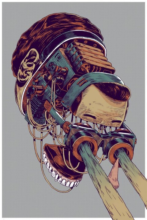
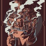
To kick things off here is something I found on Facebook which I really like. I love the earthy pastel colours which make it feel a bit like a mid 20 th century advert. The face exploding as if these are medical illustration for academic purposes combined with the modern android like characters make these very interesting.
What it means to me? The development of humans, robots, biology and information are all impressive advancements but has been painful in parts. Still there is a distinct link and representation to legacy technology perhaps hinting at the chronological development of each, a homage to where things have come from.


What fantastic technique and brilliantly executed – Its got that B-Movie feel to it too which I absolutely love. Going to find out more about this artist. Great post.
Thanks Jim, I just bought one of the print (the main one). It came in a really nice size. Very happy with it. Thanks for your note.